404 Page Optimization
Growth Experiment
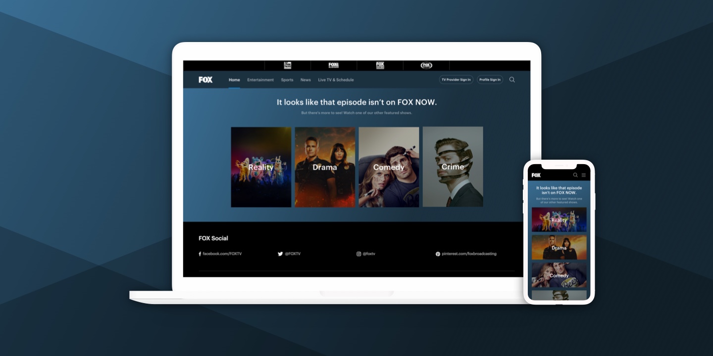
A new 404 page experience to increase engagement with users who land on the website through a page that is no longer active.
Background
The SEO Lead identified a high exit rate on traffic coming from retired show and episode URLs. The inactive URLs are a result of FOX.com rotating the availability of shows or specific seasons of shows throughout the year.
The Problem
The existing 404 page on FOX.com offered the user no insight as to why they were unable to play the show or episode they were attempting to watch and no incentive to explore other content which was resulting in high bounce rates.
Design Opportunity
Our team recognized the opportunity to run an experiment to measure the impact of using the 404 page to introduce the user to other FOX content they may be interested in and in turn increase the video start rate for the website.
The Process
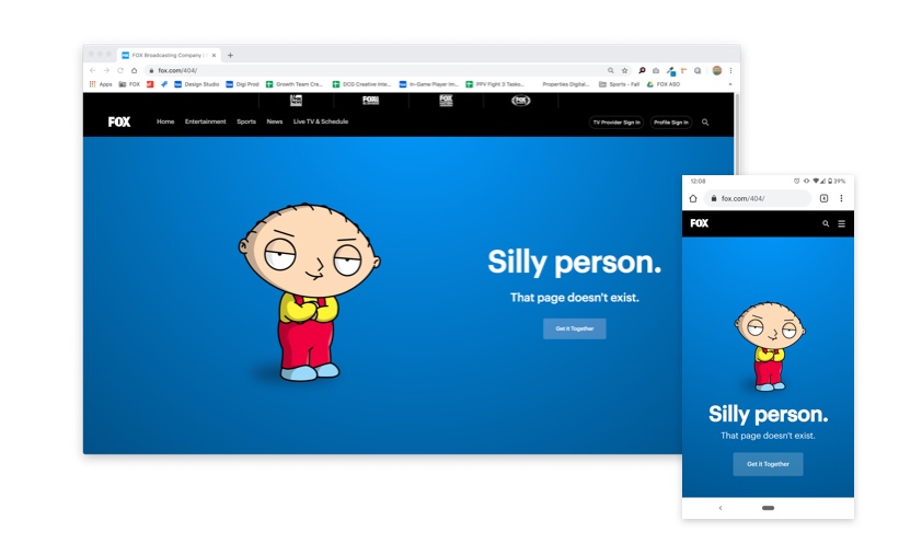
The existing page offered a CTA to proceed to the homepage and leveraged a widely-recognized FOX character to deliver the message that the page the user was looking for was no longer available. While the design and copy packed a lot of personality, its tone could be perceived as shaming the user for arriving at an error through no fault of their own.
Competitive Research
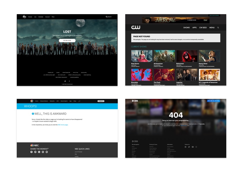
To kickstart the project, I visited the websites of the other major television networks. With the exception of ABC, whose 404 page offered the same experience as FOX’s, I found that our competitors provided their users more detailed context as to why they have arrived on a 404 page. Some had also employed their 404 page to directly introduce available content to the user or to redirect to a general “watch” page.
Key takeaways
- FOX was missing an opportunity to demonstrate to the user that their viewership mattered by not offering more meaningful context
- Competitors had also identified and were already employing the 404 page as a means of content discovery
Wireframes
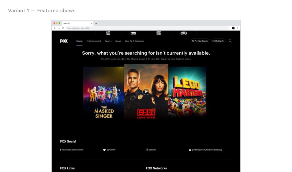
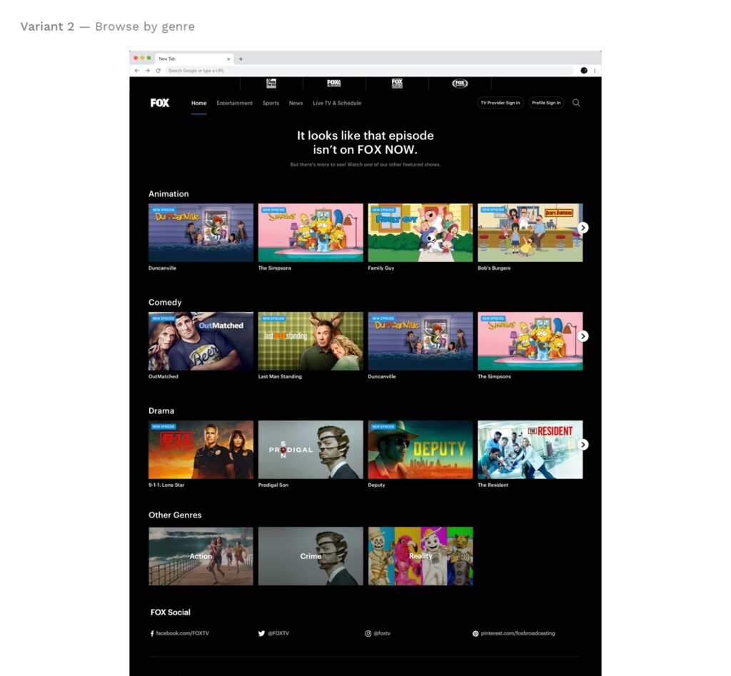
The optimization manager wanted to test the existing design (control) against two variants: one that presented the user with FOX’s top-performing shows and one that allowed the user to browse by genre.


High-fidelity mocks
Once the wireframes were presented and approved by the optimization manager, I moved into creating high-fidelity designs of the variant options and worked with our copywriter to improve upon messaging.
Testing + Insights + Iteration
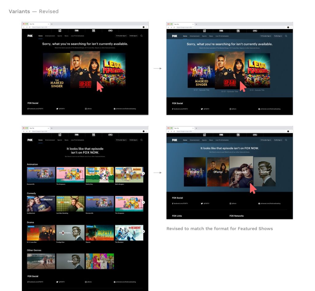
After 7 days of the experiment going live, it was found that the Featured Shows variant was outperforming the Genre variant by a large margin. We theorized that the excess of choice on the second variant was increasing the likelihood that the user would abandon the journey to a video start. In order to test the theory, we iterated on the Genre variant to follow the same design format as the Featured Shows variant.
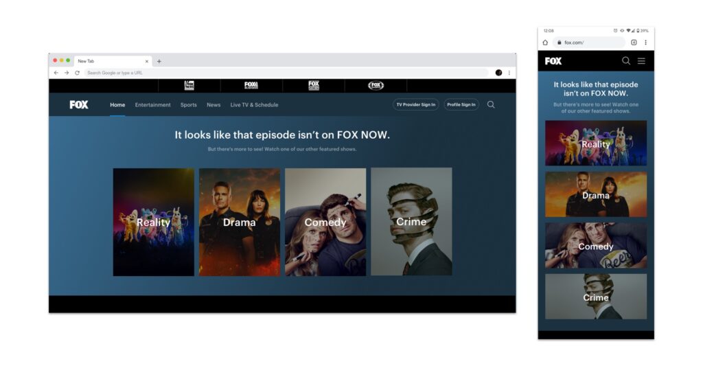
Final Design
The experiment was run for another week using the new design and the results confirmed that providing the user a more curated options landscape had a significant positive impact on engagement. The Genre variant was now outperforming the Featured Shows variant. However, both the Genre and Featured Shows designs showed an increase in clicks that could not be ignored — 60% and 43% respectively.
My Role
- UX/UI Design, Research, Prototyping
Team
- Elizabeth Lefelstein, SEO
- Zach Rains, Optimization
- David Neipris, Copywriting
Duration
- 1 month
Tools
- Sketch
- Invision
